Buenos Aires 2018
Look strategy & design
WHAT strategy & design
ROLE head of brand identity and look of the games / art direction
The Look of the Games strategy’s scope included diverse aspects and areas involved both in the organization and outside clients, which impacted in our operation and the sport competitions.
It was necessary to consolidate a strategic proposal within the budget awarded through a public tender, which included the requests the operation needed, spectators and athletes flow, esthetics requests set by the different sports and their International Federation’s rules, positions and needs from the Official Broadcaster, sponsorship agreements, Brand Guidelines and International Olympic Committee normative.
Starting from this assumptions, we divided the zones which were look elements were going to be installed within the Parks strategically in 5 zones: Field of Play, Field of Play Surroundings, Inside Venue Perimeter, venue Perimeter, and Front of House.
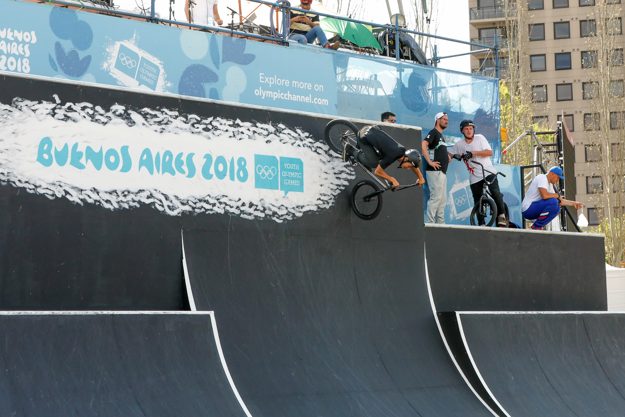
Each Buenos Aires 2018 Park was identified by a colour palette and icon. Simultaneously a Kit of Parts production document was developed were all look elements to be produced were in.
In addition to the KoP, we realized the visual exercise of applying the Brand and Look of the Games through the different court levels found on each venue and taking into consideration the camera positions from the Official Broadcaster, in order to make the best of the Brand experience to the spectators, athletes, and photo shots from OBS.
Buenos Aires 2018 Look Strategy

Field of Play & Field of Play Surroundings

_
Field of Play
Each Field of Play was specifically designed following the requests for the Sport made by it’s International Federation. Based on the initial Kit of Parts, colours and elements were adjusted in order to comply with the competition standards and sport regulations.
Different brand lecture hierarchies were developed throughout the Look of the Games strategy, so as to achieve correct brand recognition throughout the FoP and surroundings, both by spectators and cameras (OBS).

_
Field of Play Surroudings
As for the Field of Play Surroundings, elements such as double banners over courts, stand laterals and backs, wore specific brand elements customized with each Parks’ colour (look of the games and mascot) and personalized pictogram according to the sport showcased.


Inside venue perimeter
Inside Venue Perimeter
Elements on the Inside venue Perimeter, were designed with each Parks’ colour and cultural offer, creating an experience for the spectators as soon as they entered the Park.
In these case, the brand elements used were personalized by the Park colour, icon, pictograms of the sports showcased and sponsorship agreement.


Venue perimeter & Front of house

Venue Perimeter & Front of House
Regarding the Venue Perimeter and Front of House, the Buenos Aires 2018 official look was implemented, creating brand awareness in spectators and non spectators found out through the City. Most elements were applied on security metal fences, double banners which were installed on Parks Surroundings and strategic routes throughout the City.


Créditos
© International Olympic Committee